A Gorgeous Modern Neutral Color Palette For Your Home
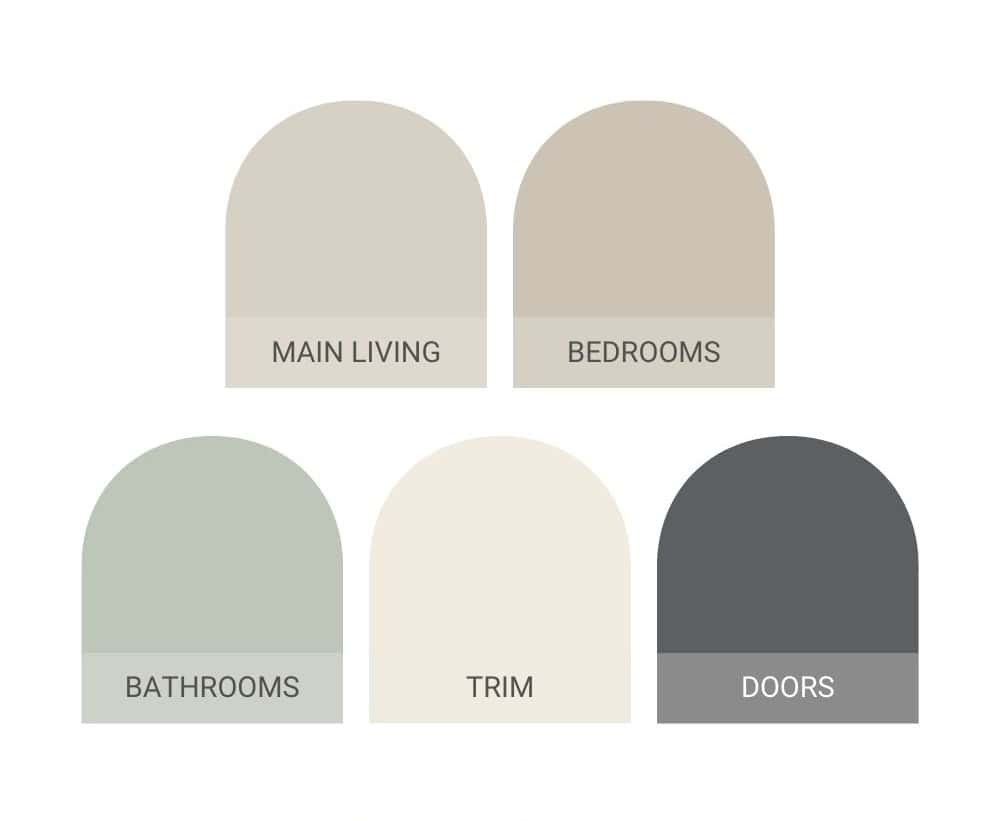
Discover the art of modern neutrals for your home with this paint color palette. From soothing greys to warm greiges, learn how to choose modern neutral colors for your entire home with a simple formula that effortlessly complements any style.
One of the most important aspects that impact the overall look and feel of your home is the color palette – specifically the colors you choose for the paint.
It is probably why I get more questions about paint colors than anything else when it comes to home design.
The truth is that paint colors can be tricky and tough to choose. I’ve shared a lot of information about paint colors over the years, including my entire process of choosing paint colors for your home, and more info about the whole home color scheme we chose for the home we’re currently living in (which features a lot of grays and greens).
When I was planning the renovation for the rental property that Logan and I worked on last year, one of the first things I needed to decide was the color palette. Because it is a rental property, we wanted to go with a neutral palette that would fit a variety of different styles and tastes. Today I’m sharing the neutral paint colors that we used!
This modern neutral color palette article contains affiliate links, but nothing that I wouldn’t recommend wholeheartedly. Read my full disclosure here.
Benefits of neutral colors on your walls
Even if you’re not designing a rental property like I was, there are plenty of reasons why you would want to choose neutral paint colors for your home.
Neutral colors are great because they never go out of style. I also love that they play nice with pretty much anything you throw at them. Whether you’re swapping out furniture, changing your wall art, or just changing up your vibe or style, a modern neutral color palette is like the chameleon of color – they just go with it.
Neutral paint colors bring a calm, cool, and collected feel to your home, which is something that many people are wanting in their living space – right? Lighter neutrals will help bounce the like around the room and make the room look way brighter and bigger, especially if you don’t have a lot of natural light to work with.
When you choose neutral colors for your walls, the colors used on your furniture and decor will really stand out and grab attention against that neutral backdrop.
Thinking long-term? Neutrals are your secret weapon when it comes to selling your house. They’re universally appealing, making it super easy for potential buyers to see themselves in your space (or in our case, potential renters).
Plus, if you’re all about those smooth transitions between rooms, sticking to neutral shades throughout your home creates this amazing flow that ties everything together and makes it feel cohesive.
Bottom line? Choosing neutral paint colors is like giving your home a design superpower. They’re versatile, calming, and seriously stylish. So, if you’re looking to create a space that’s totally you and totally timeless, neutrals are your go-to pals.
Have I convinced you yet?
A Simple Formula for a Neutral Color Scheme In Your Home
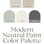
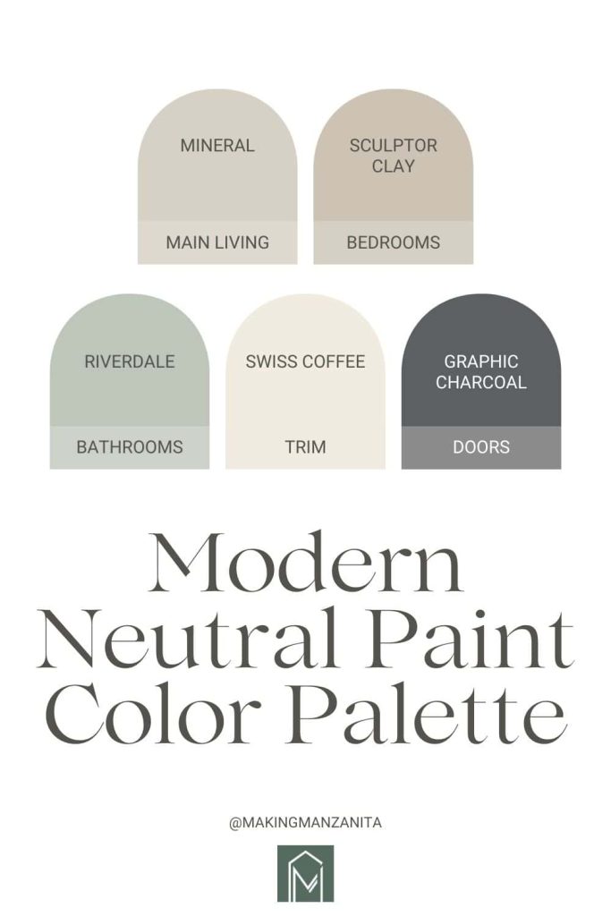
More than just giving you the paint colors that we used (which are all listed below), I’m sharing a simple formula for a neutral home so you can get this look too!
So even if you choose different paint colors or use a different brand of paint, you can apply this formula as you put together a modern neutral color palette.
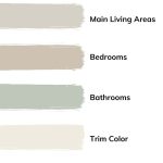
- Light neutral color for main wall color in main living areas
- Darker neutral paint color for bedrooms
- Accent colors used in bathrooms
- Off-white or cream paint color used on trim and baseboards
- Dark gray or black used on interior doors
Light Neutral Color for Main Living Areas
If you’re struggling with choosing paint colors for your home, start by simplifying things and only using one color in the main living areas.
There’s no reason why you need to have a different color in your living room, dining room, hallway, and kitchen. Do yourself a favor and just choose one. If you’re going to choose just one color, go with a light neutral color with warm undertones. Trust me on this…interior designers agree.
Opting for a light neutral paint color with warm undertones in your living spaces is like wrapping your home in a cozy bear-hug. These colors, like soft beige and greige colors (which is a mix between beige and gray), instantly create an inviting atmosphere, making everyone feel welcome.
Plus, they’re sunlight magnets, amplifying natural light and making your spaces feel more open.
While white walls can look and feel clean, they have a tendency to feel a little cold and stark. Whereas a light neutral with a warm undertone will bathe your room in a soft and warm glow – that’s the magic of using a paint color with warm undertones. They have an instant inviting vibe. They’re the friendliest shade on the color wheel, making everyone feel at home.
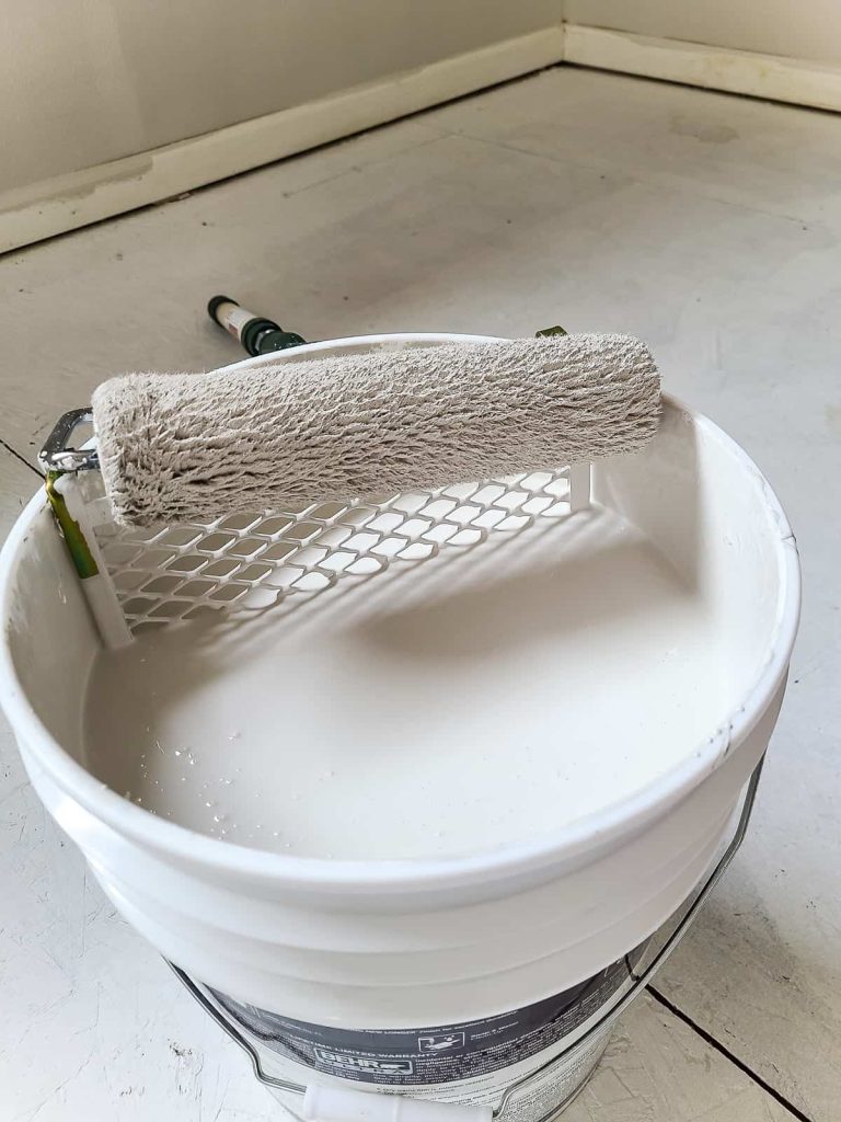
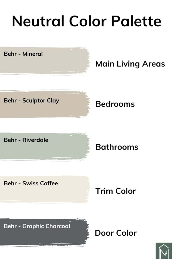
Behr – Mineral
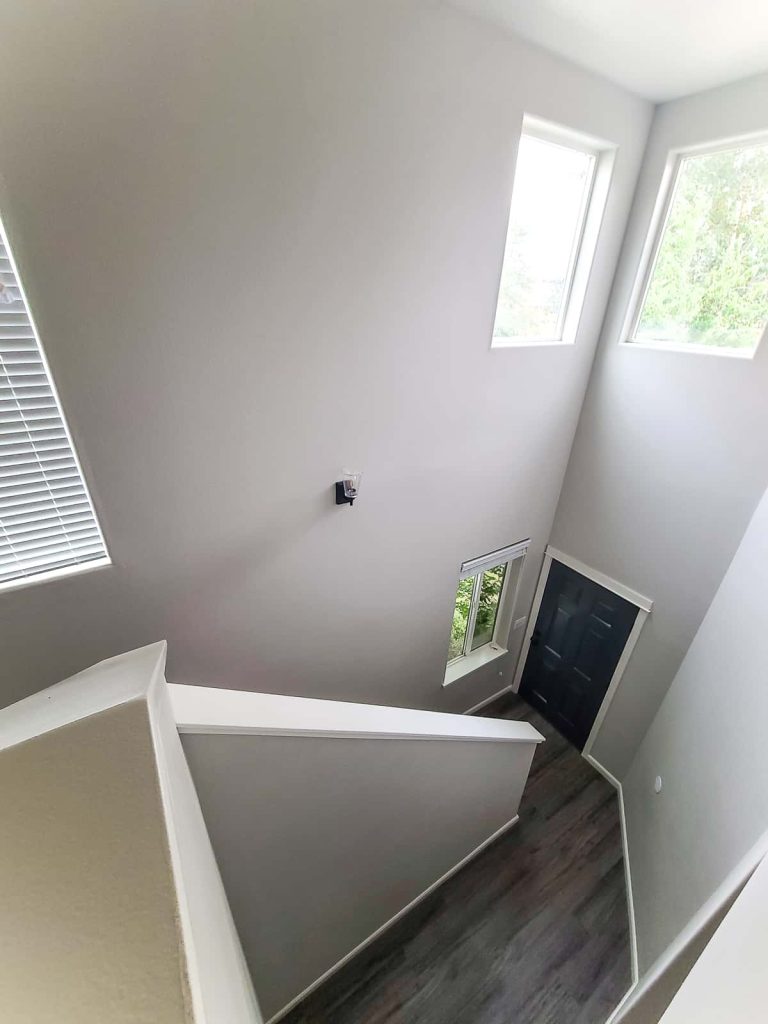
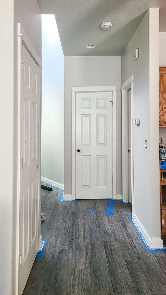
For the main living areas at this property, we chose Behr Mineral. Mineral is what I would call a soft, grayish, beige color. It’s a fabulous neutral and very similar to a lot of the other greige colors on the market. It’s a great canvas for traditional homes or rooms that already use a lot of other neutrals.
Behr Mineral is classified as a warm shade. This yellow-toned, cozy beige color is a mix of yellow and brown which creates that warm hug of a feeling while still being light and airy.
Stats
- Behr Paint Code: UL170-15
- RGB: 215 209 197
- LRV: 64
- Hex Code: #D8D1C6
Other warm neutrals that are similar to Behr Mineral
According to Behr Paint, here are other similar colors to Mineral from BEHR Paint that you might want to try out:
- Even Better Beige (DC-101) – which is part of the BEHR Designer Collection
- Blank Canvas (DC-003) – which is BEHR’s Color of the Year for 2023
- Spanish Sand (OR-W07)
- Dainty Lace (MQ3-11)
- Wheat Bread (720C-3)
- Old Map (N230-2)
Outside of Behr Paint, here are some similar options from other brands:
- Benjamin Moore – Bruton White
- Farrow & Ball – Shaded White
- PPG – Gray Beige
- Sherwin Williams – Whirlwind
- Valspar – Moon Shot
Quick note about purchasing Behr Mineral at The Home Depot
I’m not sure you’ll have the same problem, but when I went to The Home Depot to purchase Behr Mineral, they couldn’t find the paint color in their system. I also can’t find the color online at The Home Depot.
Because I was dead set on using this Behr Mineral paint color because I loved it so much, I put a call into Behr’s customer service line. They were able to give me the exact color formula to pass along to the person at the Home Depot paint desk.
Behr Customer Service also mentioned that any you’re having trouble ordering one of their colors at The Home Depot, the paint desk can always call Behr directly to get directions to make the colors.
Hopefully, you don’t have this problem too! But just in case you do, that is how you can order Behr Mineral even if The Home Depot can’t find the paint color in their computer system.
Darker Neutral Color for Bedrooms
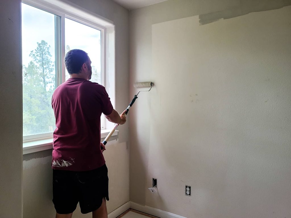
For the bedrooms, I recommend going just a touch darker for a more cozy feel. You’ll be shocked how much different a slightly darker color will make a room feel. If you’re looking at a paint chip, you can simply go one shade darker than the other lighter neutral you had chosen for your main living areas.
Why go darker in the bedroom?
Slightly darker neutral paint colors are like a warm, soothing blanket for bedrooms. They create an intimate, cocoon-like atmosphere that’s perfect for unwinding after a long day.
If you’re really brave, you can even go darker in a bedroom! Darker paint colors in a bedroom can feel like instant blackout curtains, helping you catch those precious Zzz’s by blocking out excess light.
Darker neutrals bring a sense of depth and calm, making your bedroom the ultimate relaxation zone where you can escape from the world and sink into a sea of tranquility.
For more ideas, check out these master bedroom paint color ideas!
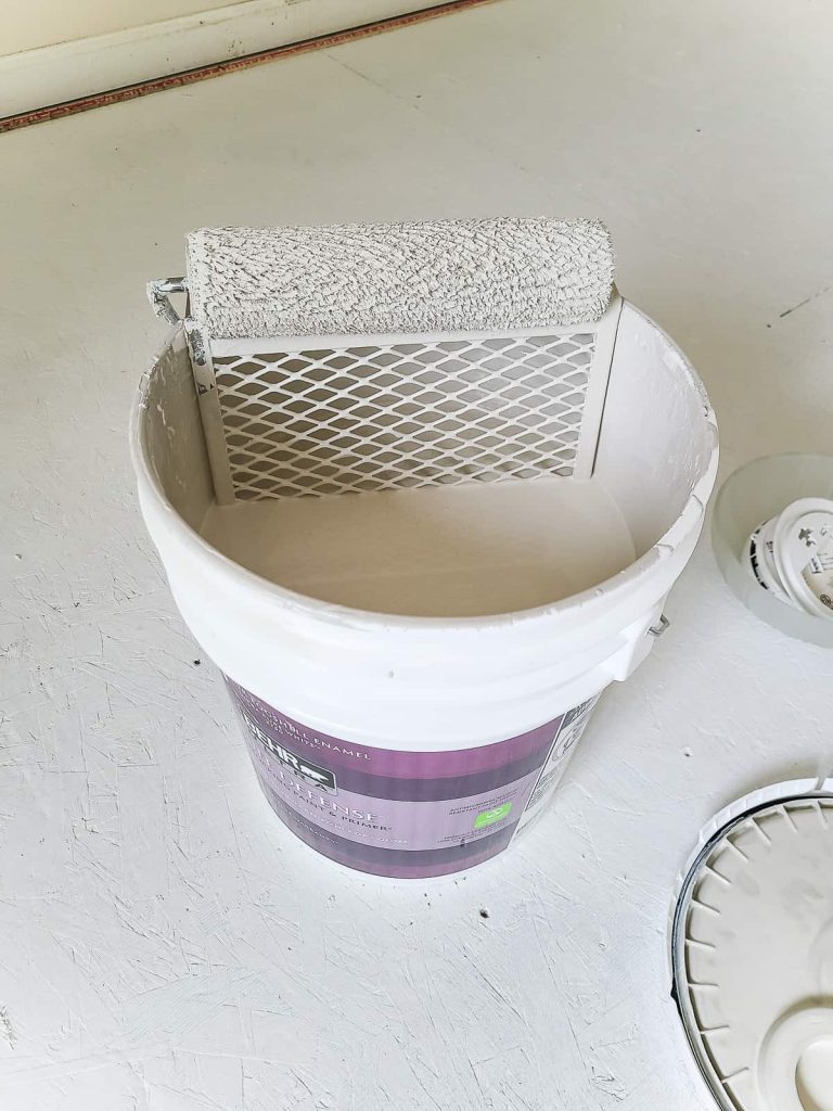
Behr – Sculptor Clay
For the bedrooms in this property, we chose Sculptor Clay by Behr Paint. It is a taupe-y shade that is almost khaki with a touch of gray.
It is still considered a greige paint color, like Mineral – just a like bit darker. It has gray-brown undertones, which give it a really earthy vibe.
We already had experience with this color because we used it in our recent guest bathroom renovation above the wainscoting panels.
Stats
- Behr Paint Code: PPU5-8
- RGB: 204 195 180
- LRV: 55
- Hex Code: #CCC3B4
Other neutral colors with warm undertones that are similar to Behr Sculptor Clay
According to Behr Paint, here are other similar colors to Sculptor Clay that you might want to try out:
- Coliseum Marble (PPU8-16)
- Yuma Sand (HDC-NT-18)
- Aged Beige (PPU7-09)
- Gray Envelope (DC-011)
- Toasty Gray (N320-2)
When it comes to other paint brands, here are some similar colors to Behr’s Sculptor Clay:
- Benjamin Moore: Alphano Beige
- Valspar Paint: Notre Dame
- Glidden: Synchronicity
- Olympic: Barefoot Beach (very close match!)
- Magnolia Home: Southern Grown
- Para: Memory Overload
- Farrow & Ball: Elephant’s Breath
Accent Color for Bathrooms
Bathrooms are a great place to bring in pops of color with your paint colors. Using a bolder accent color is a great way to explore different shades even if you want to keep most of your home with more neutral tones. We opted for a muted gray-green color for the bathrooms in this property and I love the way it turned out.
Gray-green paint colors are one of my favorites to use, which you can see if you take a look at the colors in my own home. They have become incredibly popular in recent years and they work perfectly alongside pure neutral colors, as a primary accent color for contrast.
If you want to use an accent color in the bathrooms (or elsewhere in your home as an accent wall or something else), it is very important to make sure it works well with the other different colors used throughout your entire home for a cohesive look.
Making a color palette is a great way to see how various shades will work together. I also recommend that you get paint samples to see what the real paint looks like instead of just looking at the colors on a computer screen or small paper paint chip.
And don’t forget to do some research and figure out the undertones of other colors that you’re going to be using. Learn more about my entire process of choosing paint colors here.
For more ideas, check out these small bathroom paint color ideas!
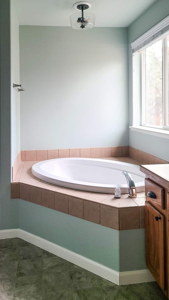
Behr – Riverdale
For the bathrooms in this property, we chose Behr’s Riverdale paint color. Behr Riverdale is a light green paint color with gray undertones. It has a spa-like feel that works great in bathrooms!
Although it is an accent color and not necessarily a neutral color, it still gives the room a light, bright feeling. I love how the paint color looks with contrasting black light fixtures and brushed nickel bathroom hardware and faucets.
Stats
- Behr Color Code: N410-3
- LRV: 55
- RGB Values: R 190, G 197, B 186
- Hex Code: #bec5bc
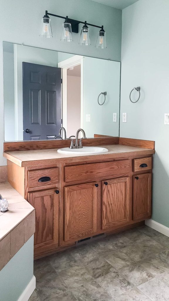
Other bold colors that are similar to Behr Riverdale
According to Behr Paint, here are other similar colors to Riverdale that you might want to try out:
- Engagement Silver (PPU25-14)
- Frosted Sage (N400-2)
- Brook Green (N410-2)
- Gray View (DC-014) – part of Behr’s Designer Collection
- Misty Coast (PPU25-13)
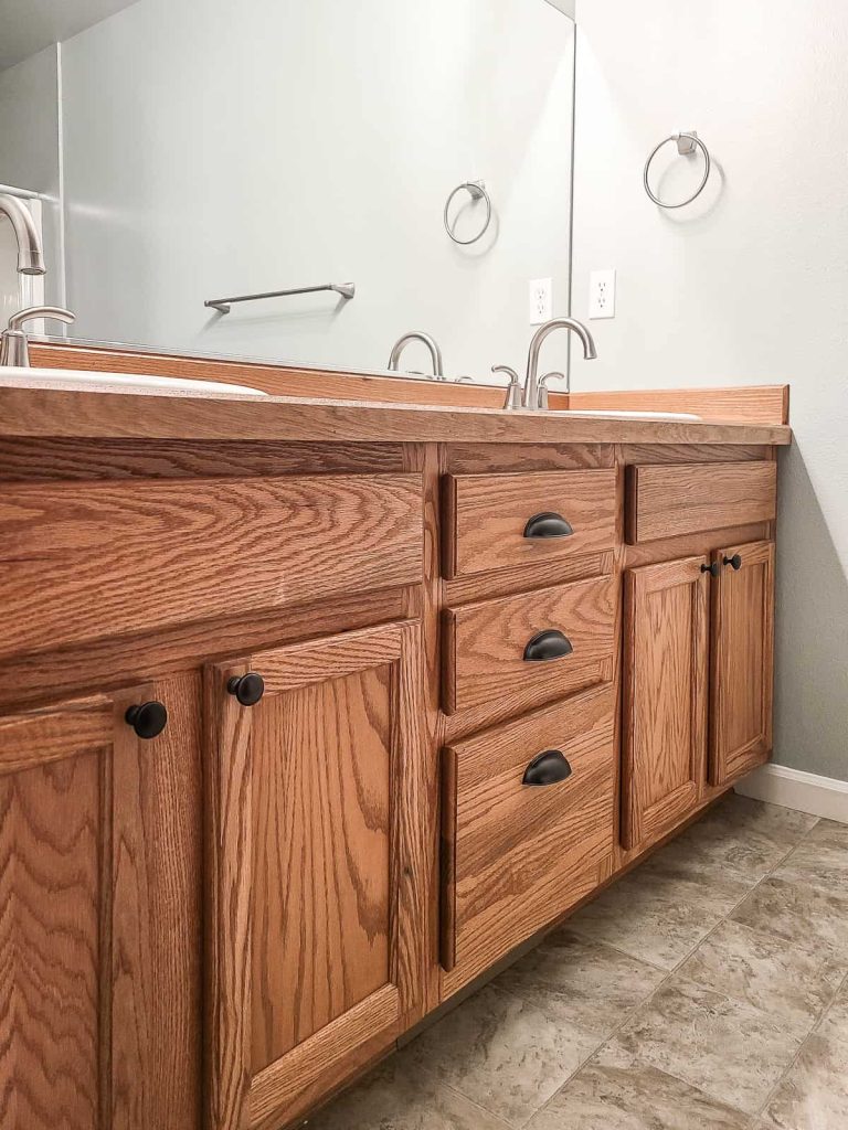
Outside of Behr Paint, here are some similar options from other brands:
- Benjamin Moore – Gray Wisp
- Farrow & Ball – Mizzle
- PPG – Balsam
- Sherwin Williams – Comfort Gray
- Valspar – Irish Moor
Off-White Color for Trim and Baseboards
Off-white or a creamy color is always a great choice for trim and baseboards. I love the look of white trim as a contrast against the main wall color, but it can be hard to keep clean. By going slightly more off-white or cream for the trim paint color, it hides things remarkably well.
Off-white trim will give your space a polished and classic look that is seriously timeless without the starkness of pure white.
Behr – Swiss Coffee
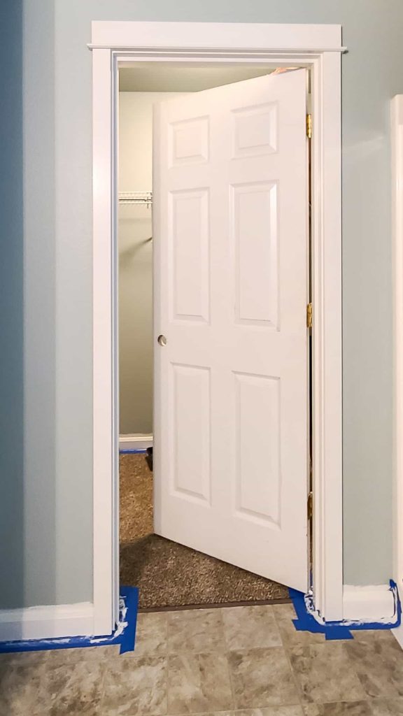
For the trim color and baseboards throughout this home, we chose Behr’s Swiss Coffee, which is a very dependable trim color. It is one of Behr’s most popular warm white colors and there’s a reason why!
In fact, when Logan used to work in property management this is the color that they would use for all of their trim work and baseboards in the rental properties.
Swiss Coffee is a creamy white that doesn’t pull in other undertones like yellow, pink, blue or green like some other white paint colors do. It’s an ideal choice for painting baseboards.
Stats
- Behr Color Code: 12
- LRV: 84
- RGB Values: R 241, G 237, B 224
- Hex Code: #f1ece1
Other creamy whites that are similar to Behr Swiss Coffee
According to Behr Paint, here are other similar colors to Swiss Coffee that you might want to try out:
- Linen White (70) – I used this color on the painted arches in our boho home office
- Nano White (HDC-MD-06)
- Palais White (GR-W15) – We used this color on the trim on the exterior paint at our first fixer upper
- Cotton Blossom (BWC-07)
- Simply White (BWC-01)
- White Stone (DC-012) – part of BEHR’s Designer Collection
Outside of Behr Paint, here are some similar options from other brands:
- Benjamin Moore – Ivory White
- Farrow & Ball – Pointing
- PPG – Candlelit Beige
- Sherwin Williams – Shell White
- Valspar – Statuesque
Dark Gray or Black for Interior Doors
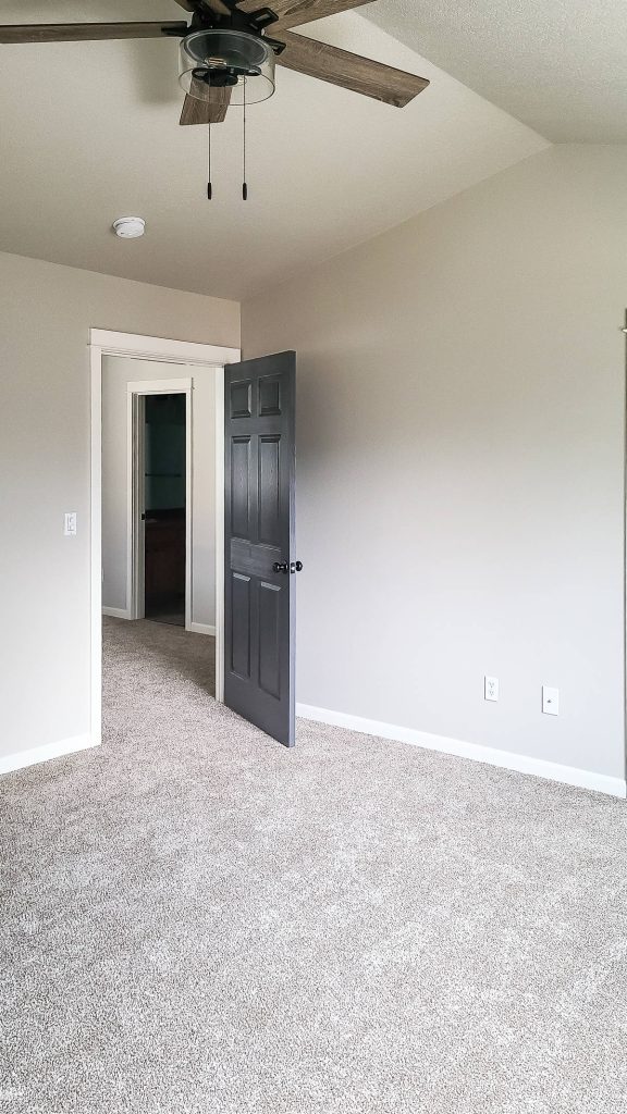
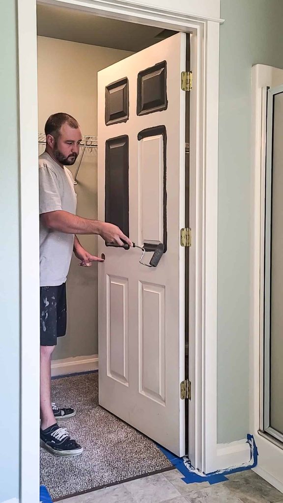
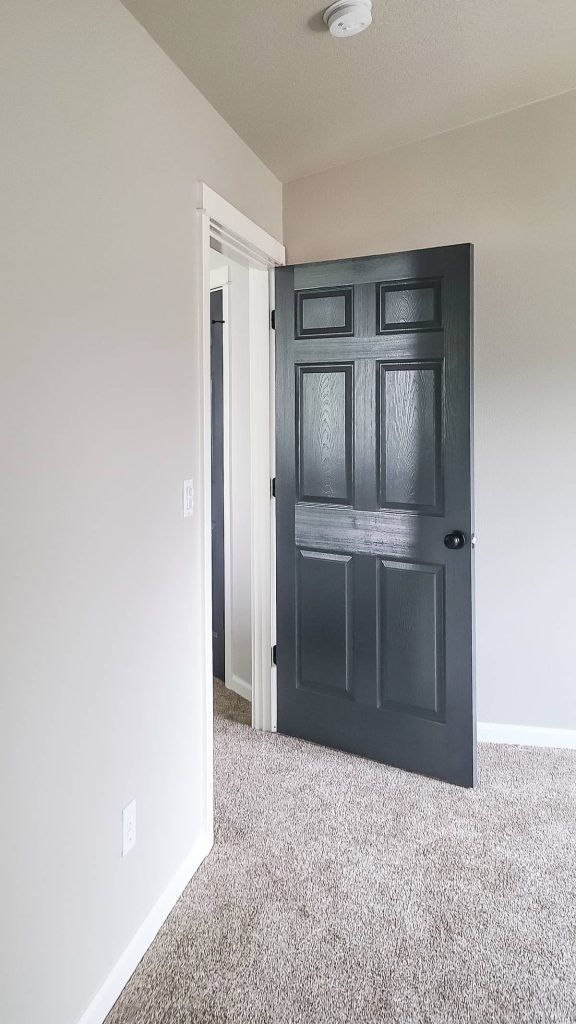
We tried something new on this property and went dark on all of the interior doors and spoiler alert, I totally love it! Although it can be considered pretty bold, I think it is a look that you won’t be sorry you tried. Dark gray (or even black) on your interior doors looks SO good!
If you have all light and bright neutral colors in your home, it will be lacking dimension and depth. Successful neutral color palettes bring in both light and dark neutrals and I think that dark interior doors is the best way to incorporate a dark color into your neutral look with a modern touch.
If you’re thinking about painting your interior doors dark, you’ve gotta check out my full guide where I share everything I learned and share some other paint color ideas (with pics!)
Behr – Graphic Charcoal
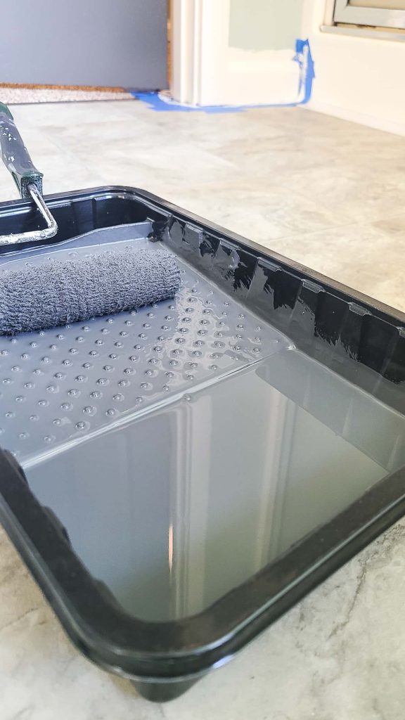
We went with a dark gray color, not quite black, on all of the interior doors at the rental property. Graphic Charcoal is what I would call a “moody” gray color.
BEHR even calls it a “soft black” color on their website. The color is deep and heavy, but sophisticated. It adds richness and bold qualities to any home!
Stats
- Behr Color Code: N500-6
- LRV: 11
- RGB Values: R 92, G 94, B 95
- Hex Code: #5c5e60
Other dark colors that are similar to Behr Graphic Charcoal
According to Behr Paint, here are other similar colors to Behr Graphic Charcoal that you might want to try out:
- Calligraphy (N490-6)
- Midnight Blue (N480-7)
- Chimney (PPU25-22)
- Satin Black (PPU26-01)
- Little Black Dress (PPU24-23)
Outside of Behr Paint, here are some similar options from other brands:
- Benjamin Moore – Mythic (this one look more purple for sure)
- Farrow & Ball – Down Pipe
- PPG – Knight’s Armor
- Sherwin Williams – Cloak Gray (this one has strong purple undertones too)
- Valspar – Muted Ebony
Related: Other Interior Painting Articles
- Choosing Front Door Paint Colors (& How To Paint A Door)
- Two Tone Walls in Bedroom: How To Paint Straight Lines
- Mountain Mural Tutorial (Featuring Behr Paint Colors Trends)
- Behr Chic Gray Paint Reveal (+ The Best Order of Painting A Room)
- Modern Sponge Painting | Semi Circle Pattern in Back of Locker Cabinets
- How To Paint An Arch Like A Pro
- A Basic Paint Sheen Guide for Interior and Exterior Surfaces
- How To Cut In Paint without Painter’s Tape
- How To Paint A Ceiling With A Roller
- Behr Fashion Gray | Paint Color Overview and Review
- How To Paint A Room For Beginners | Ultimate Guide
- Tips for Painting Baseboards and Trim
- Black Bamboo Behr | Paint Color Overview and Review
- Behr Meteorological | Paint Color Overview and Review
- Behr Falling Snow | Paint Color Overview and Review
- 16 Gorgeous Green Accent Walls
- Snowy Pine Behr Paint Overview
- In The Moment Behr Paint Color Overview
- 22 Front Door Paint Colors to Inspire You
- Master Bedroom Colors | 20 Great Paint Color Ideas with Pictures
- Behr Midnight in NY Paint Color Overview
- Graphic Charcoal Behr | Paint Color Overview and Review
- Do I need Primer Before Painting?
- How to Paint a Room Fast
- How To Clean Walls Before Painting
- Interior Painting Tools List – 17+ Must-Haves for Homeowners
- Cost to Paint a Room – DIY vs Hire Comparison
- How to Transform Walls with Just Paint: 20+ Wall Painting Ideas

