Our Whole House Color Scheme: Every Single Paint Color in 2nd Fixer Upper
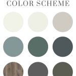
Create a whole house color scheme is key to making all of the rooms in your home feel cohesive. Check out our whole house color scheme pictures as we walk you through the color choices and every single paint color used in our 2nd fixer upper.
Wanna know the number one question I get every time I share a picture of our house?
What’s that paint color?
True story.
And it doesn’t surprise me at all. Because choosing the right paint color for your house is hard.
It’s even harder to choose ALL the paint colors for your whole house color scheme so that they look cohesive and the color scheme flows from room to room.
Table of Contents

Now that we’re done renovating this 2nd fixer-upper and turning it into a short-term rental, I’ve rounded up every single paint color we’ve used throughout the home so they are all in one place.
And when you put them all together like this, it’s evident that I gave a lot of thought to our whole house color scheme with every paint color I chose along the way.
It’s also pretty obvious that I’m a big fan of both BEHR paint and bluish green colors, right?
This whole house color scheme guide contains affiliate links, but nothing that I wouldn’t recommend wholeheartedly. Read my full disclosure here.
Whole House Color Scheme: Paint Colors
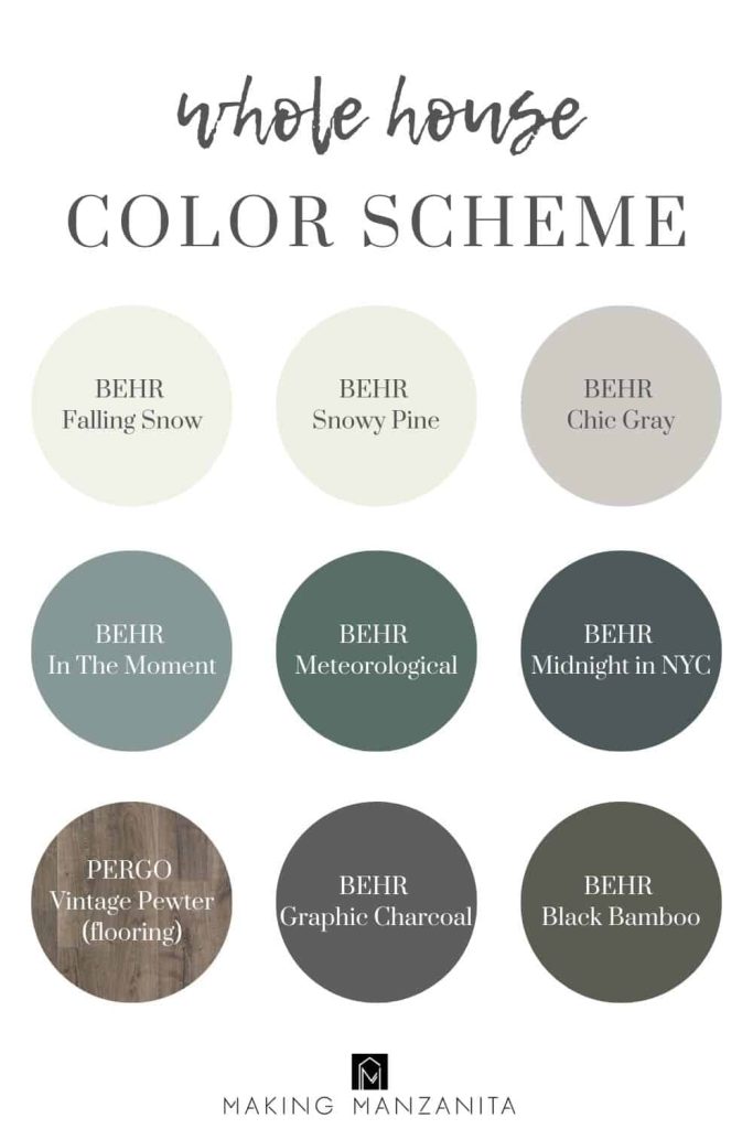
Whole House Color Scheme: Links to Paint Colors
Behr Falling Snow
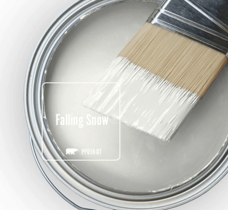
Behr Falling Snow is a great cool white paint color for walls that doesn’t feel too stark! Per Behr, it has aqua undertones, but I’ve never felt like it’s looked blue or aqua on the walls.
Want to learn more about this paint color? Check out our whole Behr Falling Snow paint guide here!
We have this painted on:
- The top half of our bedroom two tone walls
- The walls in master bathroom
- The other walls in Cal’s little boy’s bedroom opposite of his mountain mural
Behr Snowy Pine
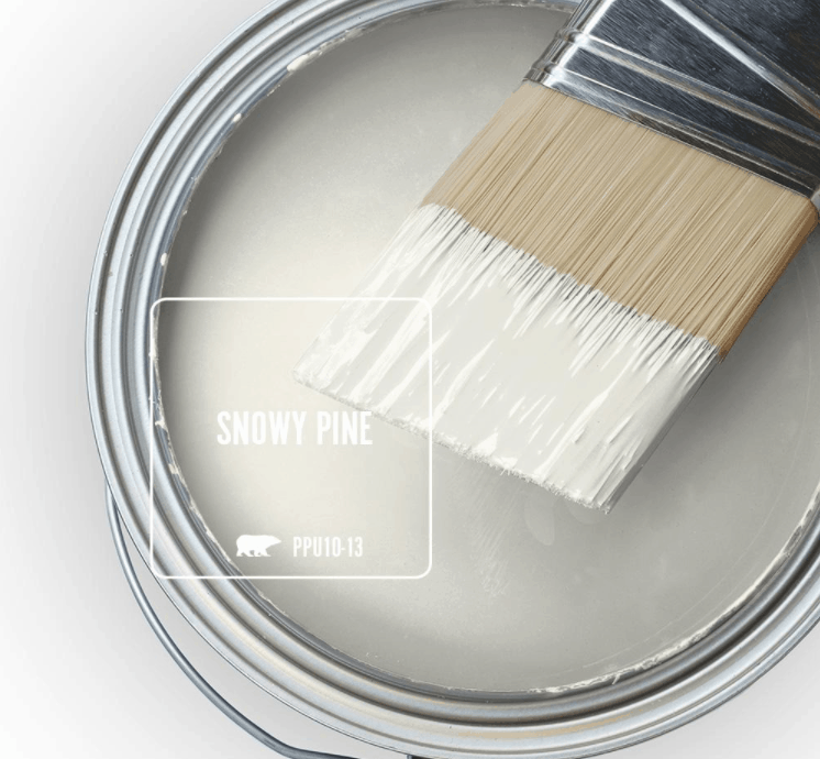
Behr Snowy Pine is our tried and true trim and door paint color. We even used it on all of the trim and doors at our 1st fixer upper.
It’s very similar to Falling Snow, don’t you think? Snowy Pine is a cool white with lime undertones, according to Behr Paint. It is crisp and clean-looking, which is great for trim.
Wondering what paint sheen to use for trim and doors? We use semi-gloss. Learn more in our paint sheen guide.
We have this painted on:
- All baseboards, trim and interior doors (learn how to paint a door here)
- Modern barn door
- Vertical shiplap wall in guest bathroom
Behr Chic Gray
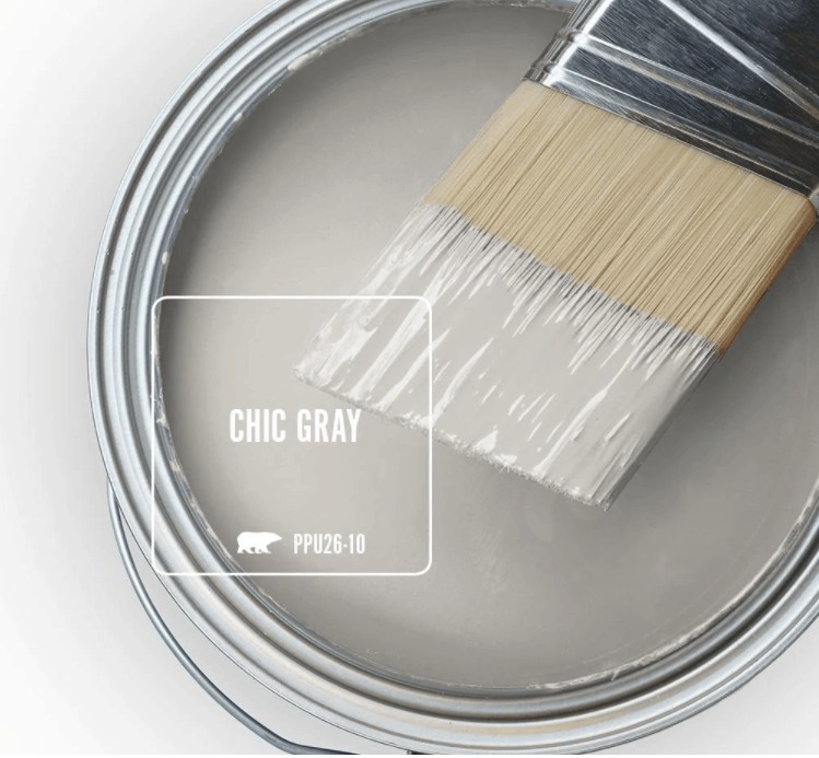
Behr Chic Gray is the paint color that I chose right after we moved in to use in the main living areas of our home when I was on a spree of getting rid of the horrible tan and baby blue color that was painted everywhere (Don’t believe me? Check out the pictures right when we moved in here).
Chic Gray is a warm gray with greige undertones. It’s much lighter and warmer than the gray color I used throughout our first fixer-upper, Behr Fashion Gray.
Want to learn more about the Chic Gray color? Check out our Behr Chic Gray guide here.
We have this painted on:
- The walls in Quinn’s little girl nursery
- The walls in our kid’s modern farmhouse bathroom
- Our kitchen (seen in this backsplash tutorial and this sink installation tutorial)
- Our laundry room
- Our hallway (seen this picture ledge tutorial, basket wall tutorial and clipboard wall tutorial)
Behr In The Moment
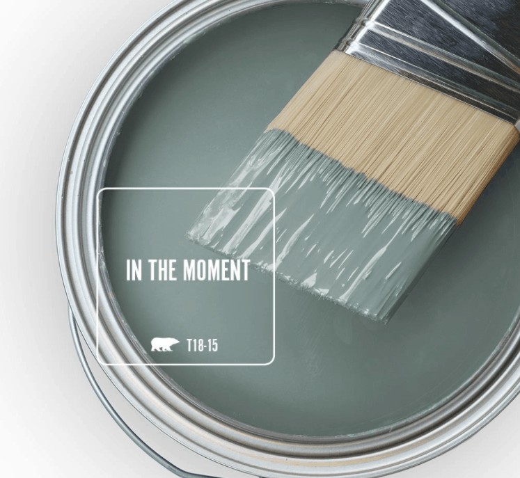
In The Moment was Behr’s 2018 Color of the Year and it was well deserved! Behr In The Moment is a soothing combination of gray, green, and blue.
Our love for this color started long ago, in our 1st fixer upper. We painted our front door with this gorgeous color. We loved it so much that we used it a couple more times in our current house.
We have this painted on:
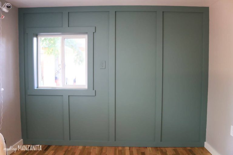
- The board and batten wall in Quinn’s boho nursery (which is one of my favorite green accent walls ever!)
- Our hallway cabinet
Behr Meteorological
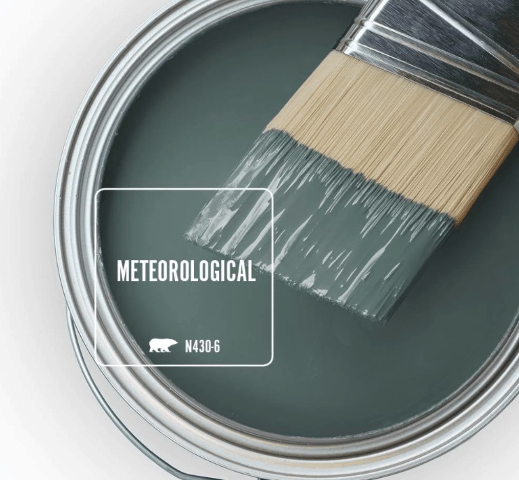
Behr Meteorological is a dark cyan or teal color that seems to really pull in those green undertones.
I’m so glad I found this color through testing a bunch of samples because we’ve used it now in three rooms of the house. Just another way to really bring that whole house color scheme through by repeating the same colors several times.
Want to learn more about this paint color? Check out our Behr Meteorological paint color guide here!
We have this painted on:
- The bottom half of our two tone walls in the master bedroom
- An accent wall behind the vanity in our master bathroom
- All the walls in our budget boho guest bathroom
Behr Midnight in NY
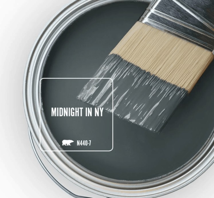
Behr Midnight in NY is a beautiful dark and moody greenish navy color. I wanted something that had a lot of drama but still fit well with the rest of our whole house color scheme.
We have this painted on:
- All the walls in our boho office
Pergo Vintage Pewter Oak
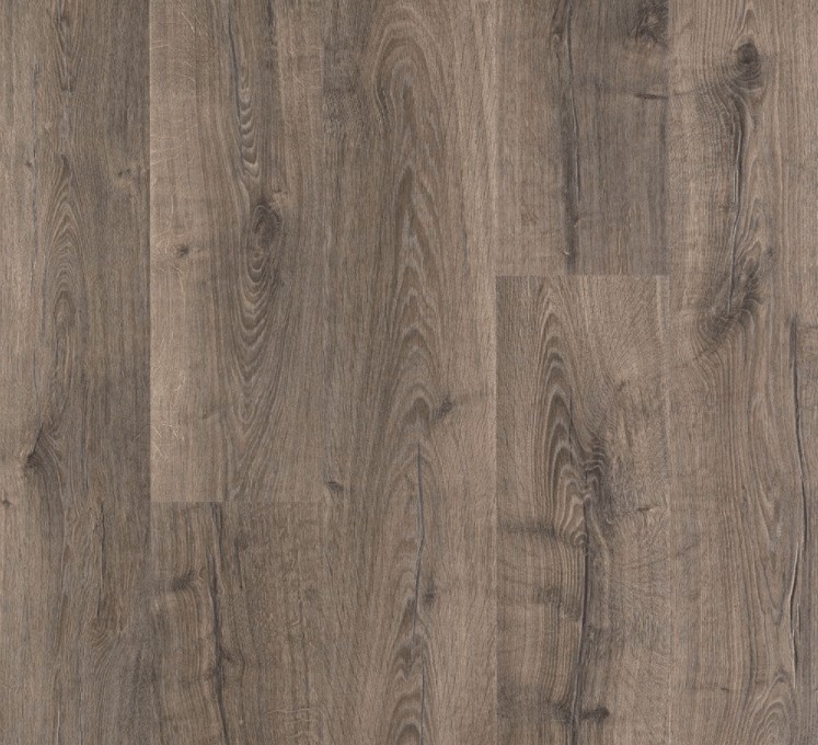
Yes, I know this is totally not a paint color! But Pergo Vintage Pewter Oak are the laminate floors we have installed in our kitchen, laundry room, and living room (the other rooms are either refinished original hardwood floors, new hardwood floors, carpet, or tile floors). So since it’s a prevalent color throughout our house, I decided to include it in this whole house color palette.
Learn how to install laminate floors here.
Behr Graphic Charcoal
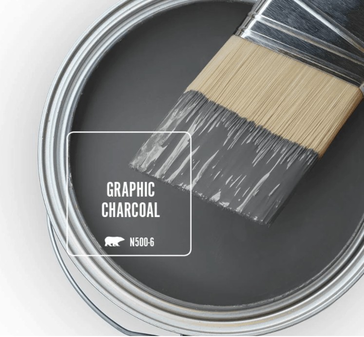
Behr Graphic Charcoal was a part of the 2020 Color Trends palette, which is how I originally found this awesome gray color. I worked with Behr to reveal their Color of the Year in 2020 and the Color Trends palette, which was SO fun. We created a mountain mural with several of the color trends and this was the main color for the wall.
It’s obvious that I fell in love with this color because I used it two more times throughout the house! Again…the more you can repeat paint color throughout your house, the more cohesive the whole house color scheme will feel.
Want to learn more about this paint color? Check out our Graphic Charcoal paint color overview here!
We have this painted on:
- The bottom part of our mountain mural
- The trim on the cabin bed in Cal’s bedroom
- The accent wall behind our grid gallery wall in the hallway
- All of the walls in our modern boho living room
Behr Black Bamboo
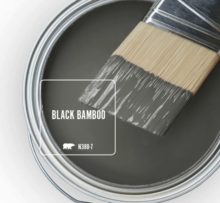
Last, but not least is Behr’s Black Bamboo. Although I only have this color in one place in our current house, I knew I loved the color because we used it on the entire exterior of our 1st house.
This color is a muddy olive green that is totally on-trend right now.
Want to learn more about this paint color? Check out our Black Bamboo Behr paint color overview here!
We have this painted on:
Whole House Color Scheme Pictures: By Room
All the colors throughout our house are fairly consistent, every room in the house has a slightly different color scheme that is pulled in through the paint colors, decor and furniture, and textiles.
The cohesive color palette of the enter house paint colors really helps keep things grounded.
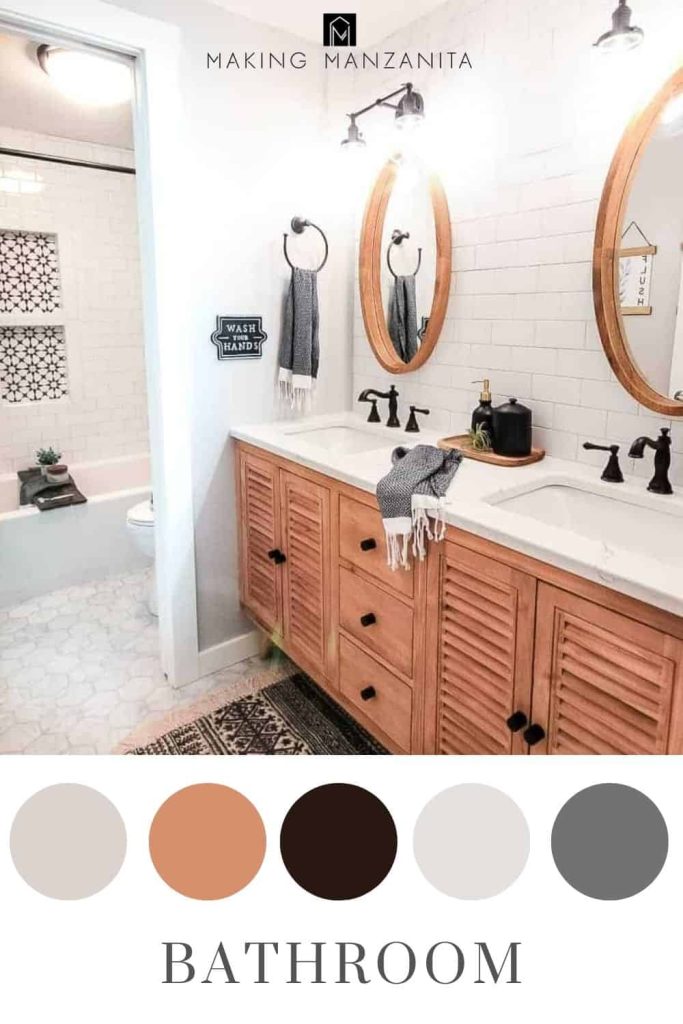
Modern Farmhouse Bathroom (Kid’s Bathroom)
The kid’s modern farmhouse bathroom color scheme stayed in mostly high-contrast neutrals like white, gray cream, black, and light wood tones.
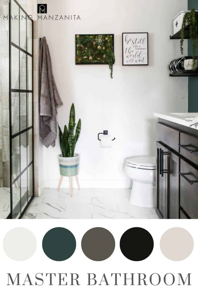
Modern Master Bathroom
Our modern master bathroom was filled with more high contrast white and black colors, but we mixed in light wood-look tiles, and dark wood tones on the vanity, as well as a green accent wall.
- Walls: Falling Snow, Behr and Meteorological, Behr
- Trim: Snowy Pine, Behr
- All other room sources linked here
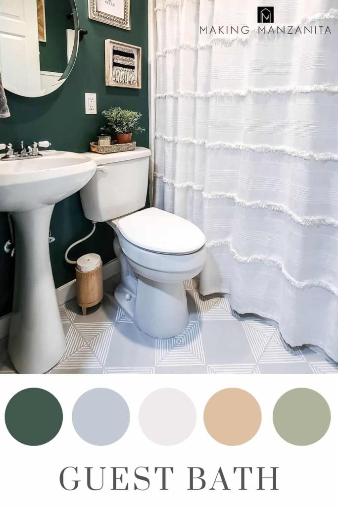
Boho Guest Bathroom
Our small, but mighty, guest bathroom brings in a color palette filled with moody dark green walls, light wood tones brought in through the decor, and this fun DIY wall art and neutrals of lots of gray and white.
- Walls: Meteorgolocial, Behr and Falling Snow, Behr (on vertical shiplap)
- Trim: Snowy Pine, Behr
- All other room sources linked here
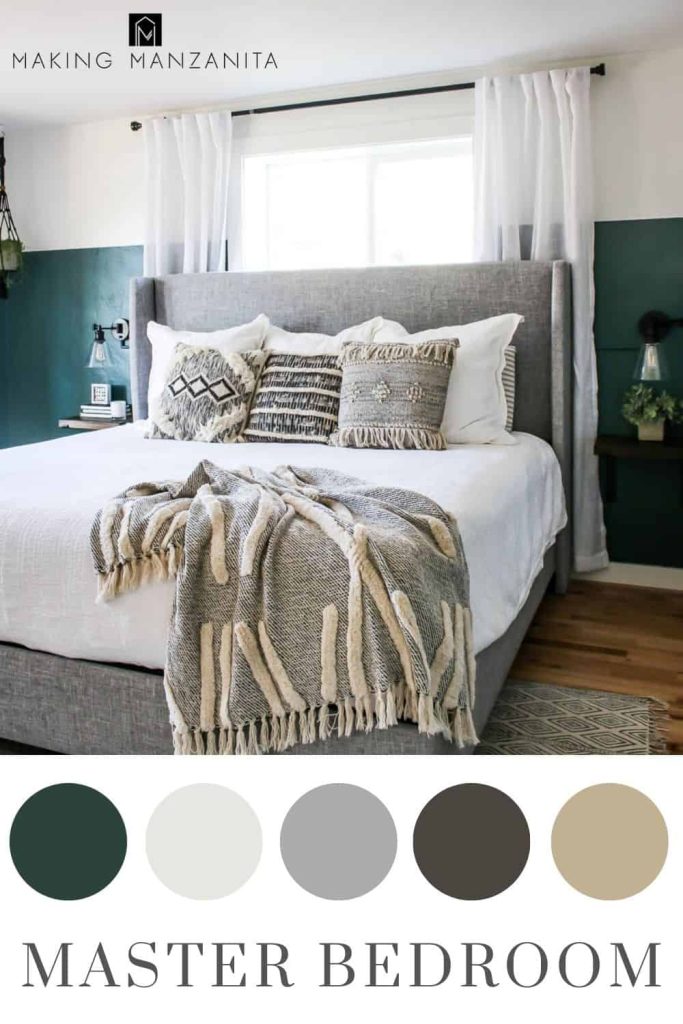
Boho Chic Master Bedroom
This was the first room in our house where we started the dark green color trend, which is carried throughout the house in different shades.
With the color-blocked green and white walls, we kept the rest of the room’s furniture and decor relatively neutral tones, with lots of white, ivory, and gray. We also let natural wood tones shine through on the hardwood flooring.
- Walls: Meteorological, Behr (on bottom) and Falling Snow, Behr (on top)
- Trim: Snowy Pine, Behr
- All other room sources linked here
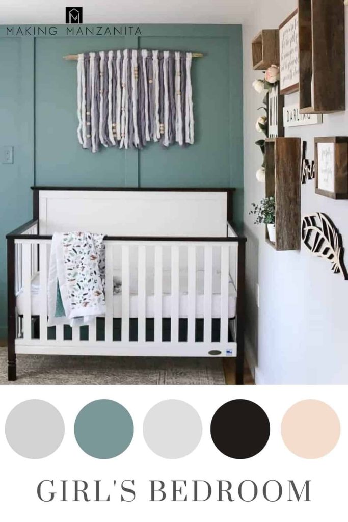
Little Girl’s Modern Farmhouse Nursery
I love that although this is a little girl’s nursery, it’s not all pink and frills. Here we showed how you can take a feminine approach to the cool color scheme, with the light greenish-blue board and batten accent wall combined with grays, white and high contrast, black trim on the white crib.
- Walls: In the Moment, Behr (accent wall) and Chic Gray, Behr
- Trim: Snowy Pine, Behr
- All other room sources linked here
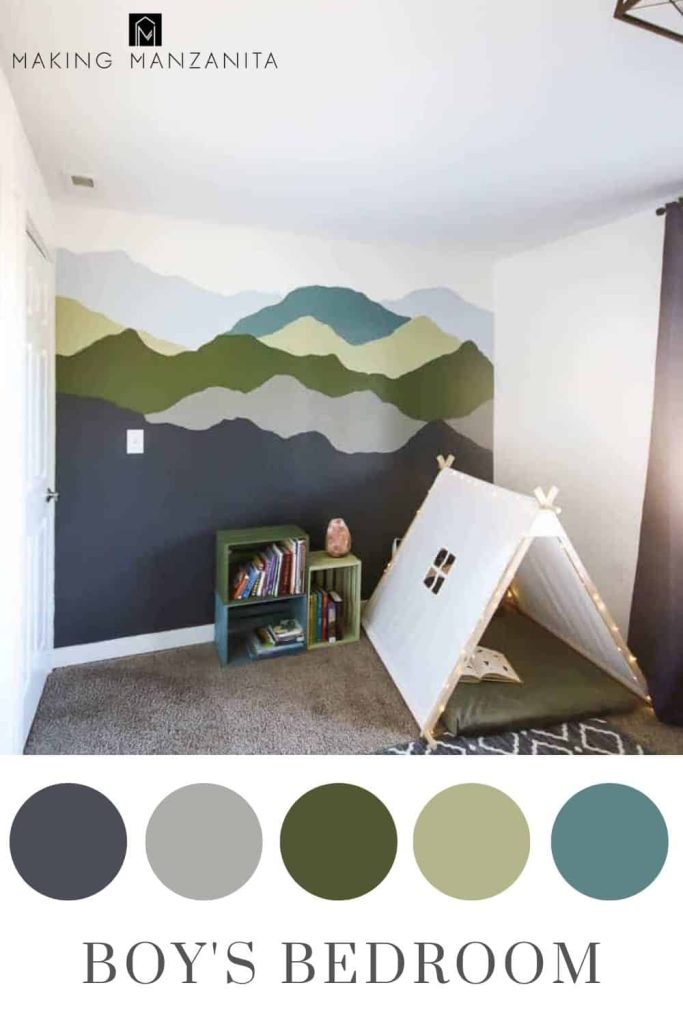
Little Boy’s Nature Inspired Bedroom
Cal’s little boy’s nature-inspired “mountain” room really brings in the full spectrum of blues and greens with this colorful mountain mural. Combined with the white walls, dark navy curtains, and the later-added cabin bed, this is such a fun room! Get more boy bedroom inspiration and ideas here!
- Walls: Falling Snow, Behr (all walls except mural)
- Mural Colors (all Behr Paint, from top to bottom):
- Trim: Snowy Pine, Behr
- All other room sources linked in the mountain mural tutorial and this cabin bed tutorial
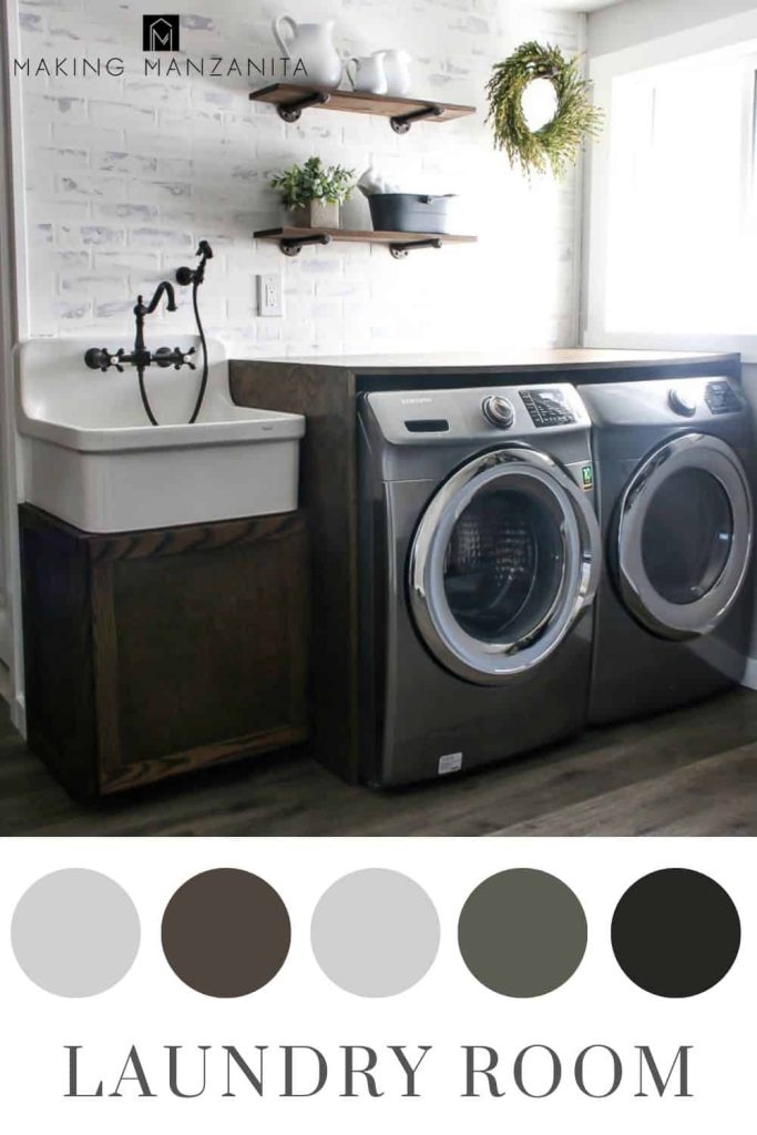
Laundry Room
Our laundry room got a pretty major renovation, but the faux brick wall, pipe shelves, and farmhouse sink cabinet addition. We also added the green mudroom locker cabinets to this room, although they aren’t pictured above. We also added some stenciled letters to the wall above the sink.
The main part of the laundry room features a neutral color scheme with the color really bring brought into the room with the olive green mudroom lockers.
- Walls: Chic Gray, Behr
- Trim: Snowy Pine, Behr
- Cabinet Stain: Dark Walnut, Minwax
- Mudroom Locker Paint: Black Bamboo, Behr
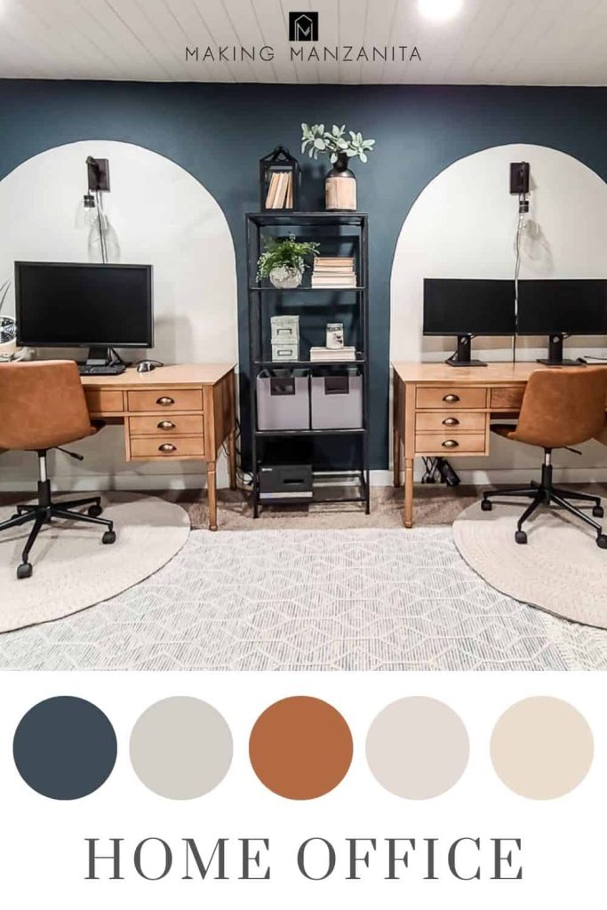
Modern Boho Home Office
Since our home office room has no windows, I really took advantage of the cozy and moody vibes and took a risk by painting all of the walls with a dark greenish navy…and it totally paid off. We lighted up the space with a white shiplap ceiling, creamy tan painted arches, the plywood pegboard wall (with colorful abstract shapes), and light area rugs.
- Walls: Midnight in NY, Behr and Crisp Linen, Behr (in arches)
- Trim: Snowy Pine, Behr
- All other room sources linked here
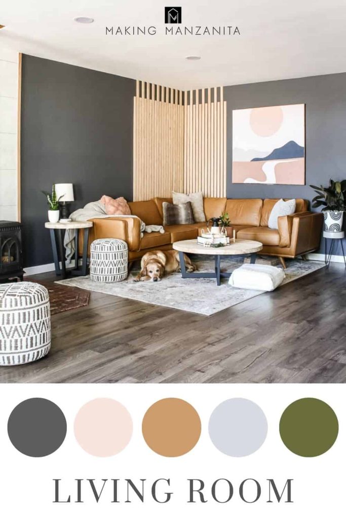
Modern Boho Living Room
Last but not least, is our modern boho living room – which is our most recent renovation. Again, we took a dark and moody choice with the walls in here because this room gets a ton of natural light.
There are a lot of light wood tones in the room with the furniture choices and the slat wall, which lighten the color palette up and contrast with the darker walls. The light faux concrete wall panels on the fireplace wall also help lighten things up.
This is the only room in the house that dark green is not intentionally brought into the color scheme through paint and decor. Instead, I added a lot of plants to the room to pull in those green tones to fit in with the greens in our whole house color scheme.
- Walls: Graphic Charcoal, Behr
- Trim: Snowy Pine, Behr
- Flooring: Vintage Pewter Oak, Pergo Outlast
- All other room sources linked here
You can see here in our whole color scheme pictures, that intentionally repeating colors throughout your home helps make all of the spaces feel cohesive. Even if you’re not using the exact same shades over and over, using lighter and darker tones of the same general colors makes a big difference.
If you’re worried a whole house color scheme is going to make things feel too stale for your taste, remember that you can pull in several different accent colors through easy-to-change decor – like throw pillows and wall decorations.



amazing blog post <3
Hi Chelsea!
You showed a beautiful chair that you said fit you and your precious children perfectly and now I can’t find it again! Can you kindly let me know where you purchased it and which area of your home it was in so I can view it again.
Thank You So Much – just love your home, your fabulous taste and so appreciative that you share the colors!
Hello Diane, the chair is in our living room and more information can be found in this article: https://www.makingmanzanita.com/modern-boho-living-room/
The direct link to the chair is: https://www.article.com/product/14702/alzey-whistle-gray-slipcover-lounge-chair